Scroll for more

Overview

Hidden in plain sight.

Shop is Shopify's consumer app; built to let users discover brands, buy in one tap, and track every order without leaving the app. We audited it. Found the cracks. Then redesigned the parts that were quietly failing users.

ResearchUX DesignPrototypingUsability Testing
40.83 → 81.94
SUS score improvement
F → A
usability grade
10
usability sessions
The ecosystem

The front door to Shopify

Shop sits at the center of Shopify's consumer ecosystem; the front door to millions of merchants, and the place where shopping, checkout, and delivery all converge.

How does it work?

Browse, buy, track. That's it.

Shop connects directly to Shopify merchants, letting users browse, buy, and track, all without touching a browser. One account. One app. Every order in one place.

The problem

Minimalism hell.

Drawing from our own experience with Shop, our team noticed friction around discoverability. We didn't assume; we went to find out why, and the research confirmed it.

What's happening with shop?
10 usability studies · 4 tasks analyzed
What does the installation process look like?
Are shoppers discovering items on the Shop app?
What are first-time shoppers experiencing?
Scenario

Carving the happy path

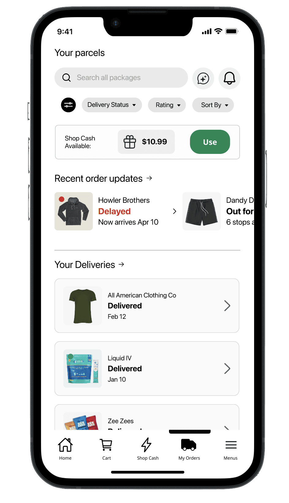
Based on our findings we prioritized three key areas: Search, Browse & Purchase capabilities, order tracking and management, and Shop Cash feature discoverability.

01Search, Browse & Purchase
From firehose to findable

The landing page felt overwhelming — no hierarchy, bare-bones tiles, and categories buried out of reach.

Before

No visual hierarchy. Minimal product info. Categories hidden behind extra taps.

After

Seasonal banner anchors the page. Tiles show what users need to decide. Categories surface on landing.

Click to expand ↗
02Track & Manage Parcels
Your orders, finally under control

Orders blurred together — status was unclear, and there was no way to filter or find a specific package.

Before

No status distinction. No search. No filtering. Just a long list and a scroll.

After

Shipment statuses visually distinct at a glance. Filter and search give users real control.

Click to expand ↗
03Find & Use Shop Cash
Making the invisible, visible

Shop Cash existed — users just had no idea. Scattered entry points and inconsistent messaging made it effectively invisible.

Before

Poor discoverability. Inconsistent messaging. No central place to learn how it works.

After

One guide. One place. Every link leads there. Shop Cash goes from hidden to actually usable.

Click to expand ↗
01Search, Browse & Purchase
From firehose to findable

The landing page felt overwhelming — no hierarchy, bare-bones tiles, and categories buried out of reach.

Before

No visual hierarchy. Minimal product info. Categories hidden behind extra taps.

After

Seasonal banner anchors the page. Tiles show what users need to decide. Categories surface on landing.

02Track & Manage Parcels
Your orders, finally under control

Orders blurred together — status was unclear, and there was no way to filter or find a specific package.

Before

No status distinction. No search. No filtering. Just a long list and a scroll.

After

Shipment statuses visually distinct at a glance. Filter and search give users real control.

03Find & Use Shop Cash
Making the invisible, visible

Shop Cash existed — users just had no idea. Scattered entry points and inconsistent messaging made it effectively invisible.

Before

Poor discoverability. Inconsistent messaging. No central place to learn how it works.

After

One guide. One place. Every link leads there. Shop Cash goes from hidden to actually usable.

👆
Swipe to explore
01Search, Browse & Purchase
From firehose to findable

The landing page felt overwhelming — no hierarchy, bare-bones tiles, and categories buried out of reach.

Before

No visual hierarchy. Minimal product info. Categories hidden behind extra taps.

After

Seasonal banner anchors the page. Tiles show what users need to decide. Categories surface on landing.

Click to expand ↗
02Track & Manage Parcels
Your orders, finally under control

Orders blurred together — status was unclear, and there was no way to filter or find a specific package.

Before

No status distinction. No search. No filtering. Just a long list and a scroll.

After

Shipment statuses visually distinct at a glance. Filter and search give users real control.

Click to expand ↗
03Find & Use Shop Cash
Making the invisible, visible

Shop Cash existed — users just had no idea. Scattered entry points and inconsistent messaging made it effectively invisible.

Before

Poor discoverability. Inconsistent messaging. No central place to learn how it works.

After

One guide. One place. Every link leads there. Shop Cash goes from hidden to actually usable.

Click to expand ↗
01Search, Browse & Purchase
From firehose to findable

The landing page felt overwhelming — no hierarchy, bare-bones tiles, and categories buried out of reach.

Before

No visual hierarchy. Minimal product info. Categories hidden behind extra taps.

After

Seasonal banner anchors the page. Tiles show what users need to decide. Categories surface on landing.

02Track & Manage Parcels
Your orders, finally under control

Orders blurred together — status was unclear, and there was no way to filter or find a specific package.

Before

No status distinction. No search. No filtering. Just a long list and a scroll.

After

Shipment statuses visually distinct at a glance. Filter and search give users real control.

03Find & Use Shop Cash
Making the invisible, visible

Shop Cash existed — users just had no idea. Scattered entry points and inconsistent messaging made it effectively invisible.

Before

Poor discoverability. Inconsistent messaging. No central place to learn how it works.

After

One guide. One place. Every link leads there. Shop Cash goes from hidden to actually usable.

👆
Swipe to explore
Prototype

Shop App

This prototype has limited functionality, but feel free to explore. To experience the purchase flow, search for the Air Jordan 1 Retro High Men’s shoe, or try the guided walkthrough to learn more about Shop Cash.

Achievements

Built to learn.

This was a graduate-level audit of a real product — 10 usability sessions, three redesigned flows, and a prototype that went from an F to an A on the SUS scale. The research drove every decision.

40 → 81
SUS score, before and after
F → A+
Usability grade, prototype tested
10
4 task analyses + usability sessions

I co-led design on a cross-functional team; running brainstorms, owning the end-to-end design process, and staying close to research to make sure every screen change was grounded in what we actually found. Looking back, I'd approach some decisions differently. But the process was rigorous, the data was real, and the outcomes showed it.

ResearchUX DesignPrototypingUsability Testing